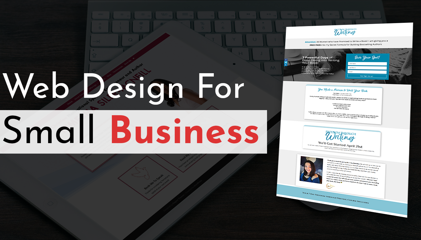
In today’s fast-paced world, people decide in just seconds if they want to stay on a website. That is why a strong landing page matters more than ever. A landing page is a single web page made to get visitors to act, like signing up, buying, or getting in touch with you. It plays a key role in digital marketing and can help boost sales and leads. This guide shares simple and helpful landing page tips to improve the quality and results of your website. It will be helpful for marketers, business owners, startups, online stores, and anyone offering services online.
Simple Landing Page Tips to Turn Your Website into a Sales Machine
Below, we have a rundown list of smart landing page tips to transform your simple website into a sales machine:
Start Strong with a Clear Headline and Offer
Your headline is the first thing visitors notice. Make it short, clear, and focused on the primary goal of your website design and development. Use words that show value or solve a problem. Add a short offer or perk for visitors below it to catch attention. A strong start helps people know what they can get and why it matters.
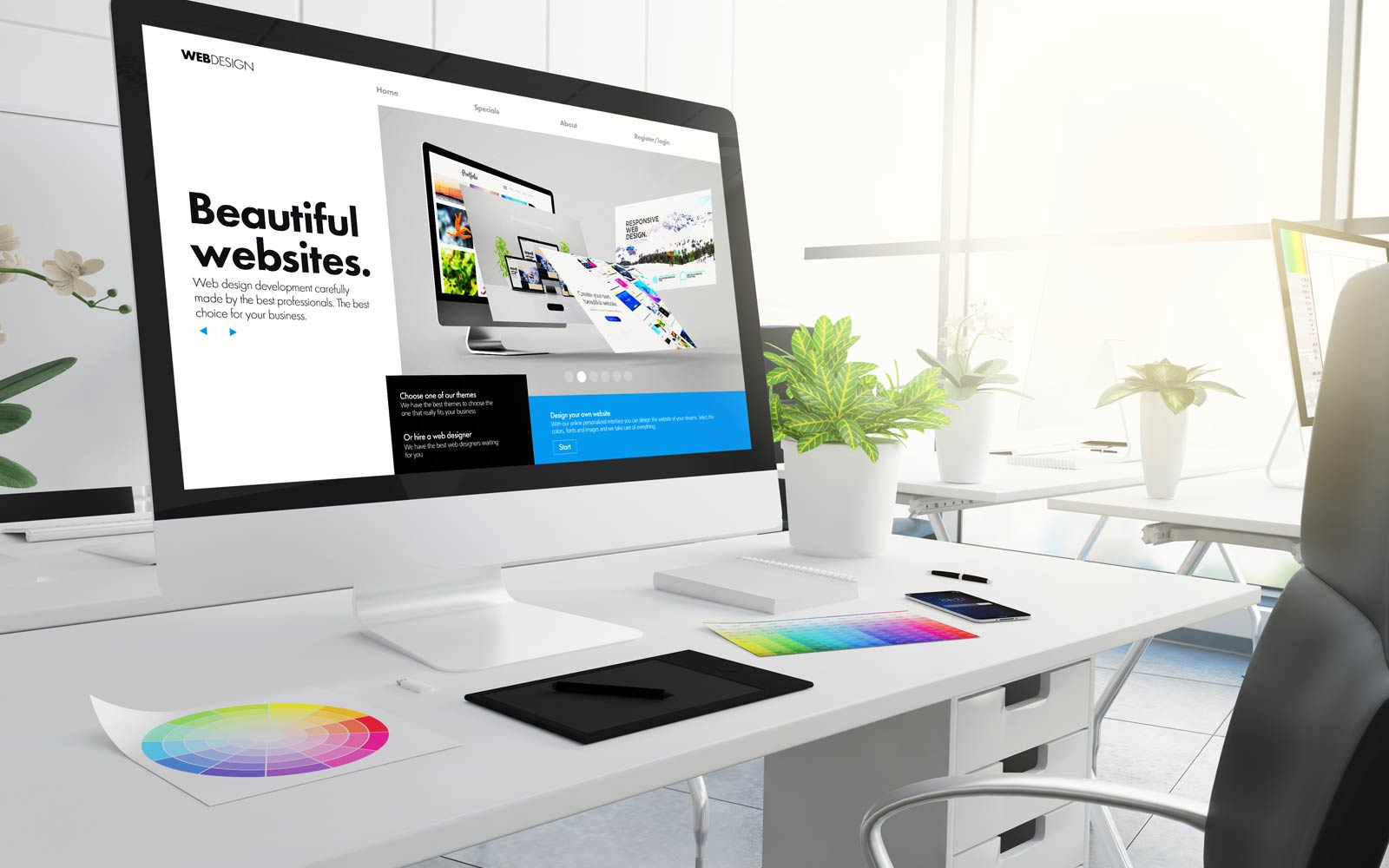
Use Eye-Catching Images and Simple Design
Images should match your message and grab attention through high-quality finishing. Use real photos in excellent graphics that tell your story. Keep the layout clean and not too busy. Use easy-to-read fonts and colors. A simple, nice design helps visitors stay longer and understand your message without getting lost or confused. This has been an important smart landing page to follow.
Make Your Call-to-Action (CTA) Stand Out
Your CTA should be easy to see and understand. Use bright buttons or bold text. Say precisely what you want people to do, like “Buy Now” or “Get a Free Quote.” Keep it short and clear. A strong CTA helps to guide users and increases their chances of acting.
Add Social Proof Like Reviews and Testimonials
Show reviews or quotes from happy customers to build trust. Use names, photos, or short stories if possible. People trust others more than ads. When visitors see that others had a good experience, they are more likely to believe in your product or service. Social proof builds confidence in your offer.
Test and Improve Your Page Regularly
Even good pages can do better. Try different headlines, images, or buttons to see what works best. Use tools to track how people click and move. Make small changes and check results. Testing helps you find what works and what doesn’t. It helps your page get better and bring more results.

Common Mistakes to Avoid in a Landing Page
Avoid adding too many CTAs. They confuse people and make them leave. Keep your form short and easy to fill out. Long, messy forms push visitors away. Use a strong and honest headline that clearly explains what you offer. Make sure your page works well on the phone. Many users visit from mobile devices. It is always the best option to hire services of top web development companies in UK to make your website work best on all devices. Don’t use hard words or company terms that people don’t understand. Use plain, clear language that speaks to everyone. These mistakes can stop people from trusting you, or they might avoid visiting your site next time. A clean, simple, and clear page works best and keeps your visitors interested and happy.
Latest Landing Page Design Trends 2025 You Must Follow
Minimalist Design with Lots of Whitespace
A clean layout helps your message stand out. Use lots of space around text and images to make it easy on the eyes. Too much content in one place can feel crowded. A simple design with white space keeps the page neat, helps visitors focus, and makes your offer easy to read.
Bold, Contrasting CTA Buttons
Your CTA should grab attention fast. Use bright colors that stand out from the rest of your page. Big, bold buttons with clear text like “Shop Now” or “Try Free” work well. Don’t hide the button, make sure it’s easy to find and encourage people to act right away.
Interactive Content, Like Sliders or Short Videos
Moving images, sliders, or short videos make your page more fun. They keep people interested and explain your offer faster. A short video can show how your product works or share a customer story. Just make sure it’s simple, loads quickly, and doesn’t distract too much from your main message.
Trust-Building Elements “Above the Fold”
“Above the fold” means the top part of your page before scrolling. This is where trust signs should go, like star ratings, happy customer quotes, or secure checkout icons. People decide fast, so showing the trust signals early helps them feel safe and ready to stay or buy from your site. Taking help from top website design companies in Bristol can support you better in adding such interactive elements.
Mobile-First Layouts with Sticky CTAs
Most people use phones, so your page should look great on small screens. Use a mobile-first design that loads fast and is easy to read. Add a sticky CTA button that stays visible while scrolling. This keeps the action button in sight and helps users take the next step anytime.
Key Things to Consider Before Designing a Landing Page
Before designing, think about who your target audience is. When you hire any web development company in London, they always ask about your website’s main theme and target audience category. Understand their needs and what problems your page can solve for them. Identify where they are in the buying process. Set clear goals for tracking success, like conversion rates or bounce rates. Make sure you know what the next step is after someone converts, whether it’s making a purchase, signing up, or getting in touch. These things help ensure your design is focused, effective, and moves visitors toward taking the right action.
FAQs
1. How are the homepage and landing page different from one another?
A homepage shows many things about your brand. A landing page talks about one offer or goal to make visitors act.
2. How long should a landing page be?
It depends on what you are offering. Keep it short for easy actions. Make it longer if you are selling something big or need to explain more.
3. How many call-to-action (CTA) buttons can be added on a landing page?
It’s better to use one primary CTA. Too many choices can confuse people and lower your results.
4. How often should I update my landing pages?
Check your landing pages every month. Always make changes if you are updating any product, adding a new design or changing the marketing.
5. Is it essential to hire a developer to design a landing page?
You can hire expert developer services from Whizmo, which offer the best results in designing creative and attractive landing pages for your website.
Transform Your Business with Whizmo Landing Page Design Services
At Whizmo, we specialize in creating eye-catching and effective landing pages that convert. Our designs are simple, clean, and optimized for user engagement. We focus on clear messaging, bold CTAs, and smooth navigation to ensure your visitors act. Whether you need a sales page, lead capture form, or product showcase, Whizmo’s landing page services will help you stand out, build trust, and achieve your business goals. Let us bring your vision to life today!