In today’s digital world, B2B businesses need to have a strong online presence. The majority of people, before making any purchasing decisions, look for products and services online. An effectively designed website earns trust and leaves a stunning first impression on the buyers. Responsive web design is all about giving your site an attractive and inspiring touch with a friendly interface. A better user experience will bring higher engagement and more leads. It allows you to reach the clients at any time, any place and highlights that the business is professional and modern and would be ready to serve them. Responsive web design is not just a fashion club; it’s a business trick. This guide provides you with more insights on improving your B2B presence with a fully responsive web design.
Understanding the Concept of Responsive Web Design
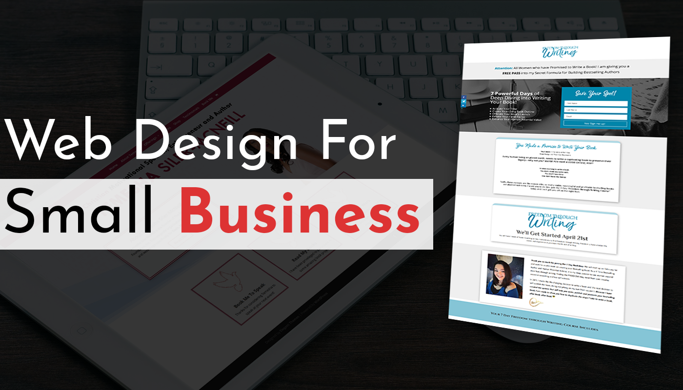
Responsive web design is a smart way of creating website design and development that will automatically adjust to any given screen size, i.e. an Android, iPad or even a desktop. Adaptive design is a fixed layout for a particular device. In such cases, a mobile-friendly design may be a suitable option for working on all devices. Responsive design provides the best user experience anywhere. For responsive design, sites such as Whizmo in the B2B world serve clients conveniently on various devices. This helps the businesses to stay professional, accessible, and enjoyable, no matter how one visits the site. It enables the site to be flexible and future-ready.
Need for Responsive Web Design for B2B Businesses
The B2B buyers tend to do research online before making purchase decisions. They search for reliable websites which can easily be navigated and are helpful in getting useful information. Most professionals use smartphones and tablets to browse when in meetings, on a trip or after working hours. If, upon their visit, your website doesn’t open correctly on their device, they will exit right there and then.
A responsive web design means your site will look professional on all screens. This develops trust, enhances credibility and keeps users happy. In a B2B competitive environment, a seamless mobile-ready guest experience that ‘just works’ can make the difference between winning or losing a client. This makes them think that you also appreciate their time. Hiring top web development companies in UK can guide you more on achieving successful web designs for your business growth.
Key Features of a Fully Responsive B2B Website
Flexible Layouts and Grids
A fully responsive B2B website uses flexible layouts and grids. This makes it possible to smooth adaptive re-sizes for various screen sizes. Thus, your content will be organised and easy to read on any device. It also brings a consistent, professional look when accessing it from a desktop, tablet, or smartphone.
Scalable Images and Touch-Friendly Elements
Re-sized images are scalable. Zooming not only blurs visuals but also slows down your site. The touch-friendly items, such as big buttons and easy-to-tap menus, enhance the experience on the mobile device. It brings out convenient and easy navigation for busy B2B users on the go.
Fast Loading Speed
Speed is critical in B2B websites where the decision-maker desires the ability to access information quickly. A responsive website is optimised to have fast loading times. This helps reduce bounce rates while increasing engagement. Poorly loading sites also have a lower ranking in search engines. Hence, this contributes to a B2B business having fewer potential clients and a reduced ability to maintain them.
Cross-Browser and Cross-Device Compatibility
Responsive websites operate without issues with all major browsers and devices to deliver the same high-quality experience to every visitor, regardless of whether your client navigates the pages with Chrome and Safari or with Firefox on any of the following – a phone, laptop or tablet. They will use a professional and trustworthy platform that communicates your business’s standards and reliability.
Guidelines on How to Implement Responsive Web Design
For the implementation stage, start by hiring experienced and top web development firms. This is important if you want to implement responsive web design on your B2B site successfully. Consider agencies or professionals who have impressive portfolios and good client feedback. They should understand how to design responsive layouts that will help achieve business goals.
Use responsive design frameworks such as Bootstrap or Foundation, which are reliable options. These tools come with pre-made components, making it easier to build flexible, mobile-friendly websites. Other frameworks can also be used for more customised solutions.
Lastly, test your website on all devices; this is important. Use checks such as testing through Google’s Mobile-Friendly Test to see how well it does. You can also test directly on tablets as well as smartphones to identify any problems with design or functionality. Such an approach guarantees a smooth, professional user experience across all screens.
Common Mistakes to Avoid You Should Know About
When designing a responsive best web development in Manchster, do not forget about its page speed. Sites that load slowly frustrate visitors and make them leave early. Also, the chaotic design makes it difficult to read content on small screens. Keep it clean and organised. Another mistake is the poor navigation structure. Keep it friendly and straightforward to help viewers find what they need.
Lastly, inconsistency in branding points on various pages or multiple devices may confuse potential clients. Ensure logos, colours, and messaging are the same. Such common problems damage user experience and trust levels. By resolving them, your site will have that professional look, fast loading, perfectly smooth navigation, and tell the visitors what to do where. All the elements are hence necessary for long-term success in the B2B digital world.
FAQs
What is a responsive website?
A responsive website adjusts its layout to fit any screen size, from desktop to smartphone.
Why is responsive design important for B2B companies?
It improves user experience, builds credibility, and helps capture leads across all devices.
Does responsive web design affect SEO?
Yes, it boosts SEO by improving page speed, reducing bounce rates, and meeting Google’s mobile-friendly standards.
How is my B2B site responsive?
Use tools like Google’s Mobile-Friendly Test or check how your site displays on phones and tablets.
Enhance Your Website with Whizmo’s Fully Responsive Web Design
Kickstart your presence in the digital world with Whizmo’s specialised web design services to achieve B2B wins. Our fully responsive, beautiful websites will react perfectly on all sorts of devices, offering a painless web interface. Whizmo makes your online presence sound louder and more engaging, and it converts visitors into loyal clients. Leave a lasting mark on your potential customers – partner with us now!