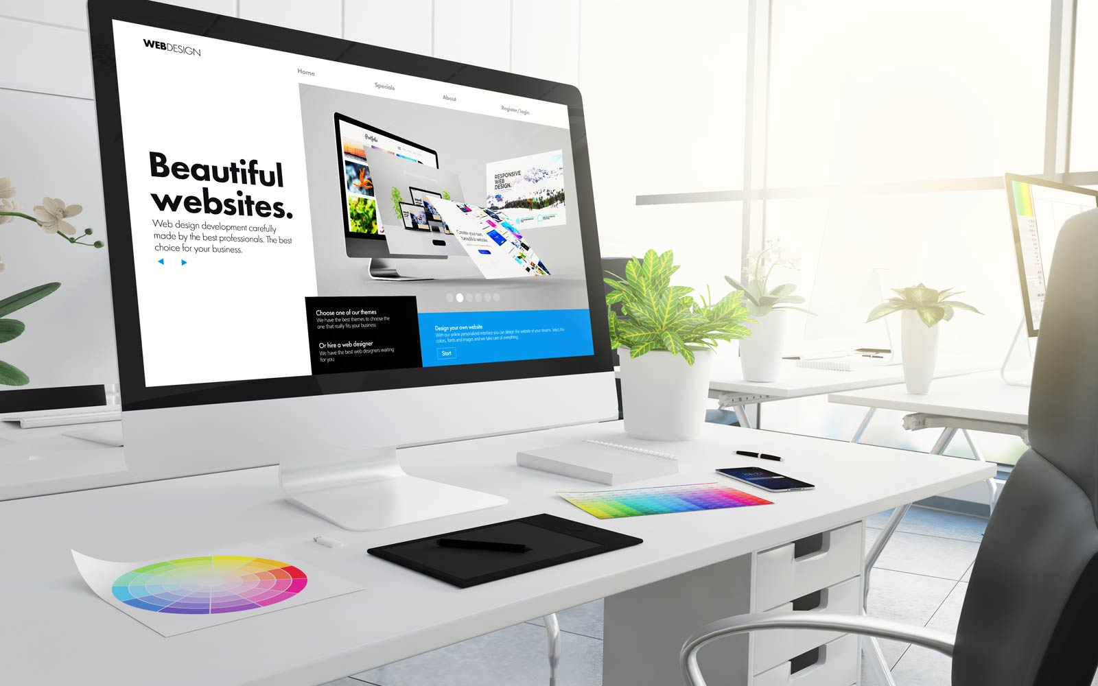
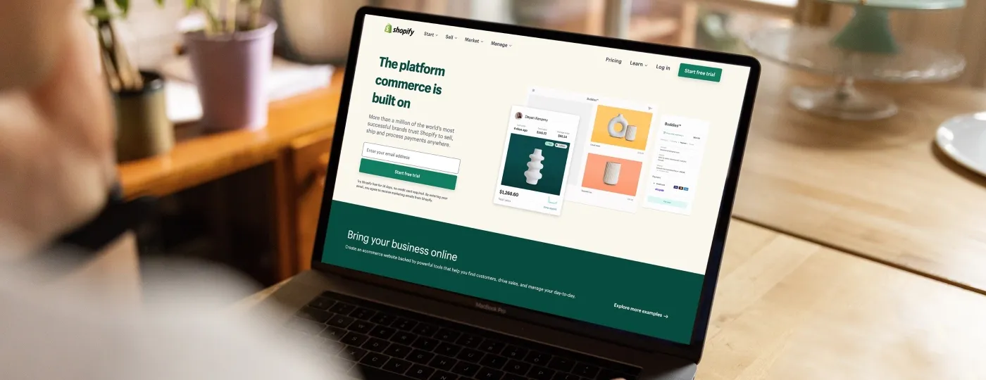
Before designing a website, you check how your rival websites have been developed and what makes them attractive. It is not just the great design but also the involvement of a friendly interface and the best functionality that makes the website worth visiting. No matter what size/type of business you are running, you need to create a beautifully crafted web design. But sometimes, in a hurry, you make certain mistakes that can stop visitors from coming and returning. This guide will highlight basic web design mistakes you should avoid when designing a site in 2024.
List of 10 Common Web Design Mistakes to Avoid in 2024
Mistake No 1: Lack of Responsiveness on a Website
A responsive web design naturally adapts to fit into the device it is being viewed on, thereby offering users the best experience. Mobile device users will find a disorganized layout, little writing, and challenging navigation without responsiveness. This can result in user frustration, bounce rates, and probable conversion loss. Use flexible grids and a mobile-first design, and test your website across several devices. This will guarantee an exciting user experience and remove any other weaknesses in a web design.
Mistake No 2: Accessibility Is Not Given Value
Ignoring accessibility might exclude many of your audience and can even cause legal consequences. Using Web Content Accessibility Guidelines (WCAG), use alt text for images. You can also include transcripts for video content for a best website design. This will ensure that your website is easy to access with a keyboard, which will boost the accessibility.
Mistake No 3: Complicated Design
Imagine negotiating a webpage that is too difficult even to grasp the structure. Always remember that perfection of detail is crucial. Complex designs can overwhelm consumers and make finding information difficult or finishing projects difficult.
Try to prioritise simplicity and clarity in your web design to avoid such degrees of complexity. Make good use of whitespace, maintain neat layouts, and concentrate on the basics to lead people to their intended activities.
Mistake No 4: Lack of Appropriate Information
Users mostly visit websites looking for details on your offering. If they fail to locate what they are seeking, they will leave earlier than one could have imagined. Ignorance of information can erode confidence and reputation. Describe your goods or services thoroughly, include FAQ sections, and highlight contact details.
Mistake No 5: Font Size and Style Is Not Consistent
Inconsistency in font size and style can confuse guests and give your website an unprofessional impression. You have to create a typographic hierarchy. Use a limited range of fonts and sizes in your web design that fit your brand. It is important to guarantee legibility across all devices if you wish consistency across several web pages.
Mistake No 6: Using Bad Colour Combinations
How a website uses colours is far more important than it first seems. Colour may affect the time visitors spend on your website and attitude. On the other hand, bad mixes could cause visual discomfort or render the material illegible.
Use a colour palette representing your brand to prevent this situation and guarantee enough contrast between text and background colours. Tools for testing your palette for accessibility and readability include colour contrast checkers.
Mistake No 7: Using Extra-Long External Links
Although they can offer extra value, overly strong links might cause users to leave your website early. Control outside links to have them easily opened in the new tabs and avoid distracting from your main material. Use them sparingly and give their location great thought.
Mistake No 8: Inadequate Security Measures
Hackers are on the rise as software programs become more important these days. Hiring reliable web design agency can help you to perform the measures better. Ignoring security could cause data leaks and erasure of confidence. Security standard practices include SSL encryption, frequent software and plugin upgrades, and safe password rules. Teach your staff security knowledge as well to help to avoid typical weaknesses.
Mistake No 9: Not Including Call to Action
Essential for turning guests into consumers, a call to action (CTA) directs users to the next action. Users with a clear CTA could know what to do, hence missing possibilities. Create successful CTAs by using action-oriented wording. Try to add visually striking language and thoughtful placement across your web design.
Mistake No 10: Lack of Easy and Simple Navigation of the Website
Simple and easy navigation of a web design is necessary. Complex navigation frustrates consumers by confusing them and reduces their capacity to find information. Use clear labels, properly arrange material, and guarantee simple navigation by including a search tool. Moreover, do frequent tests to find and correct any layout problems in website navigation.
What Other Additional Mistakes Should You Avoid?
- Give primary importance to SEO analytics, even if the content is short. SEO analytics with the support of web design company helps you understand how well your website is performing in terms of Google ranking and customer positioning.
- Add fresh and updated information to your website. If any visitor is visiting your website after six months, they should be introduced to new information.
- Avoid adding clutter of information and images on the interface. Make it easy for the visitor to read.
- If you are about to make any changes to the web design, it needs to be done with proper planning and thinking.
Conclusion
To maximise your website’s benefit, following certain guidelines and avoiding basic mistakes is extremely important. Avoiding mistakes will save you time and money. When I started my e-commerce website, I always find an issue to look for knowledgeable website designer near me. Whizmo has a skilled team of designers who can help you create an amazing website. Contact them now and explain the website theme you are looking for.


